Insights 2.0
Rebuilding the core client reporting platform for RMs serving UHNI and family office clients. Information architecture, data visualization, and workflows for the places where serious money gets decided.
The platform RMs used every morning was the platform they trusted the least.
Insights was the core client reporting platform serving Relationship Managers across the firm. The tool they opened first thing in the morning to pull portfolio snapshots before client calls, and the tool they complained about the most.
Data lived in three different places. The legacy version was built in 2018 for UHNI and family office clients and had slowly drifted out of sync with how RMs actually worked. RMs were exporting everything to Excel and rebuilding views from scratch, every single day.
RMs were losing 90 minutes a day rebuilding views the platform should have given them.
We talked to 14 RMs, 3 portfolio managers, and 2 heads of wealth across two weeks. The same three things came up:
- Portfolio hierarchy didn't match how RMs actually thought about a client. They think by family, not by account.
- Performance numbers were scattered across tabs. Comparing a client's portfolio against a benchmark took 6+ clicks.
- Every client review started with a CSV export. The platform was a read-only surface to leave.
The goal became clear: make the morning client review happen inside the platform, not around it.
Two things we couldn't change.
- The underlying data models were locked to the existing warehouse. We could reshape the surface, not the source.
- RMs had years of muscle memory on the legacy screens. We had to earn the rebuild, not impose it.
A new information model, then the interface.
Instead of starting with screens, we started with the mental model. We mapped how a senior RM actually thinks about a client: family, relationship, portfolio, holdings, transactions. Then rebuilt the IA around that hierarchy.
Once the hierarchy was right, the screens fell out of it. A single client canvas replaced the six tabs. Benchmarks, allocation drift, and transaction history became permanent companions, not separate pages. The dashboard answered the four questions every RM asked first: what moved, what's at risk, what needs action, what to talk about.
"The first week, I caught myself Cmd+Tabbing to Excel. By the second, I didn't need to."
Data visualization was the second half of the work. We moved from legacy donut-chart defaults to a restrained palette of four chart types, each tied to a specific question an RM was trying to answer. No chart existed without a reason. Every state (empty, loading, stale, drift) was drawn, not left to the developer.
A glimpse, not the whole thing.
Insights 2.0 is live inside a private wealth platform. What's below is a preview of the design work: three hero surfaces walked through in narrative, and a grid of deeper surfaces from the rest of the platform. The full process, artifacts, interaction prototypes, and the NDA-guarded context sit behind a request.
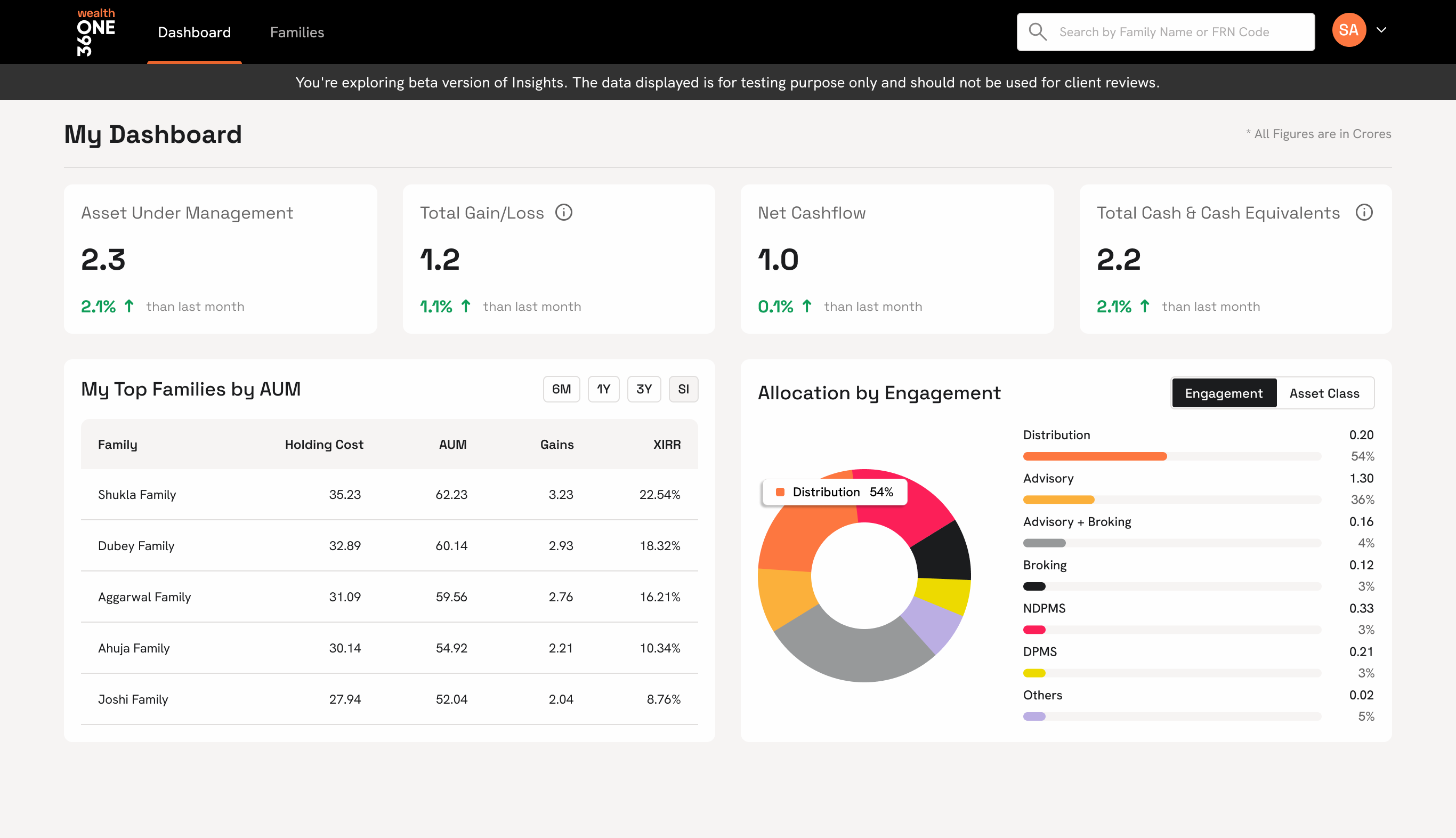
The morning dashboard
The first screen every RM opened. AUM, gain/loss, net cashflow, cash equivalents, top families, and the live asset mix. All resolved before the first call of the day.
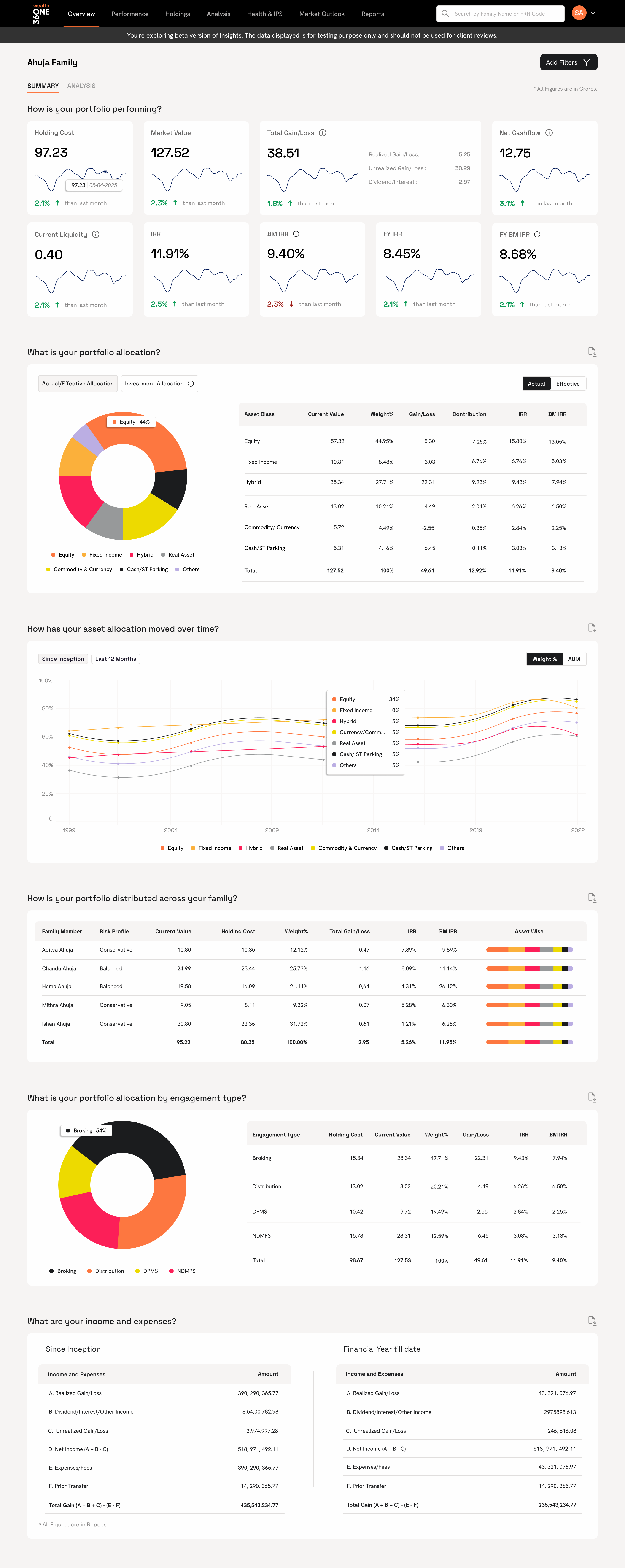
Portfolio overview. One canvas per client.
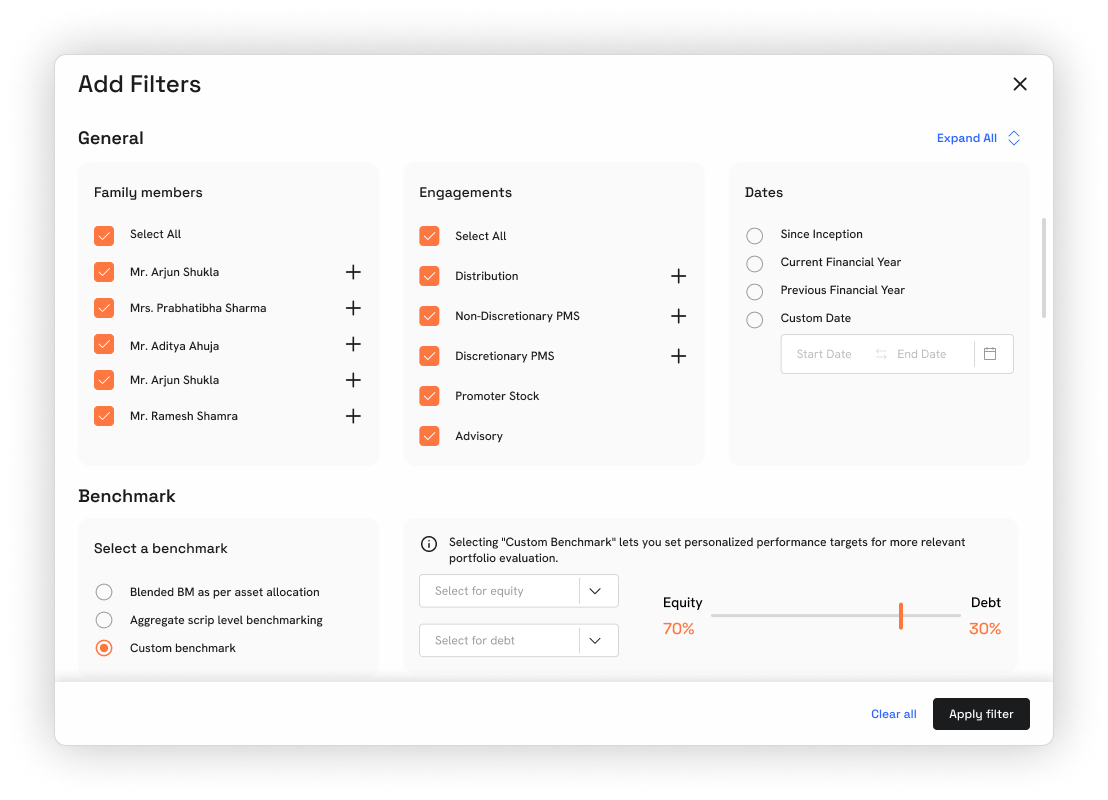
The single client view that replaced six legacy tabs. A holistic snapshot across every asset class with filters for family member, engagement, date range, and benchmark. Resolved in one scroll.
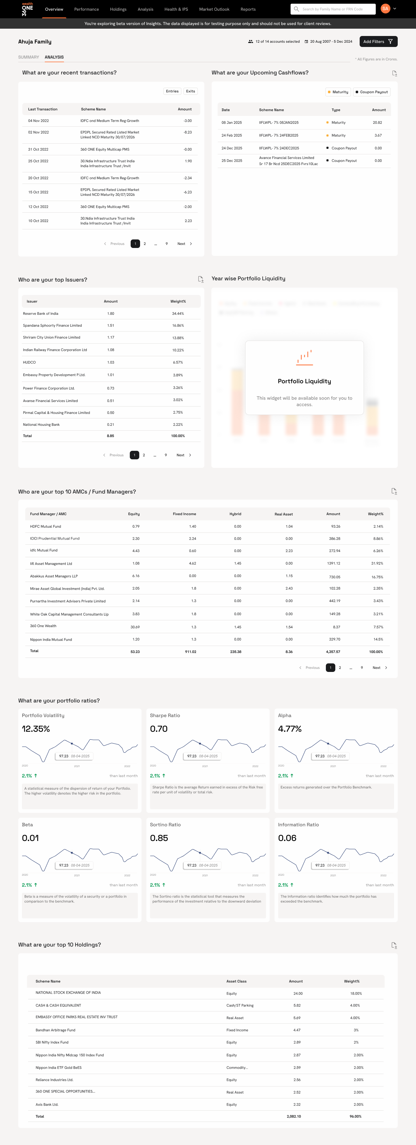
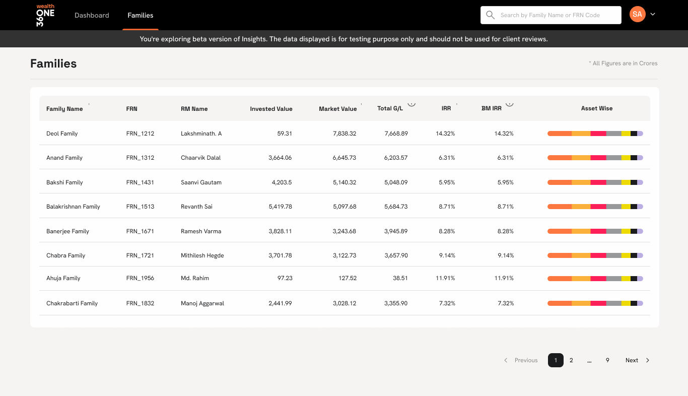
More from the platform
Deeper surfaces I can walk you through live: families, holdings (with fund-level cards), cross-asset analytics, portfolio health & IPS tracking, and the market outlook panel.
The work shipped on the design system I built in parallel.
Insights 2.0 was the first product to fully consume ONE Design System, the internal design system I built and scaled across four wealth product lines. Tokens, components, and chart primitives all came from the system, which meant the rebuild moved faster and the handoff stayed clean.
Measured in the only thing that matters: time RMs got back.
The best data-heavy software looks like less, not more.
The old version was trying to prove it was powerful by showing everything. The rebuild earned trust by showing only what answered a question. Every screen had a job. Every chart had a reason. The rest got removed.
RMs handle real money for real families. Their tools don't need to be beautiful. They need to be honest, fast, and quiet. That became the bar for everything that shipped after.