Reva
Designing and building an AI-native personal finance companion for India. A product where conversation is the primary interface, not a feature bolted onto a dashboard.
Reva is officially live on Google Play.
Download it, sign in with Google, and Reva builds your financial profile from your existing bank SMS in under two minutes.
India digitized payments. It forgot to digitize understanding.
UPI processes 12 billion transactions a month. You can pay a street vendor in two taps. But the infrastructure that helps people understand their spending never arrived alongside it. Indian financial literacy sits at 24%. That is not a content problem, it is a format and access problem. CRED, Fi, Jupiter all built dashboards for people who needed conversations.
Finance apps answer the wrong question.
I talked to young professionals in their 20s and 30s about money. The same tension kept showing up. Existing tools assume you already know what to do with the information. A pie chart is useful if you have a budgeting framework. A net worth tracker is useful if you know what net worth means. These people needed a knowledgeable friend, not a BI dashboard.
- The real question is never “show me a chart.” It is “can I afford this?” or “am I going to be okay this month?”
- Manual tracking has near-100% drop-off within the first week. If the user has to enter data, it will not work.
- Financial literacy content exists online but is generic, jargon-heavy, and disconnected from real numbers.
- There is real emotional weight here. The product needed to reduce financial anxiety, not add cognitive load.
“I don’t need another dashboard. I need someone who knows my money and can just tell me what’s going on.”
Three filters. If a feature did not pass all three, it did not ship.
- Conversation first. The AI chat is not a feature inside the app. It is the app. Everything else exists to feed context into the conversation or give the user a glanceable summary.
- Zero-input by default. Value the moment you open it, with no entering, tagging, or categorizing anything. On-device SMS parsing was not an optimization, it was a core design requirement.
- Grounded, not generic. Every AI response is built on the user’s real numbers: their actual income, actual spending, specific goals. Anything less is just a search engine with a chat skin.
Start with the interaction model, not the screens.
I did not begin with wireframes. I started by writing out conversations. What would it feel like to text someone about your money and get genuinely useful answers back? That exercise clarified the product architecture. Four surfaces, each with a distinct job:
- Chat. The primary interaction surface. Ask questions, get answers.
- Dashboard. Passive health check. Answers “am I okay?” in under three seconds.
- Goals. Motivation layer. Abstract saving becomes visible progress.
- Learn. Long-term engagement. Builds the financial vocabulary that makes everything else more useful.
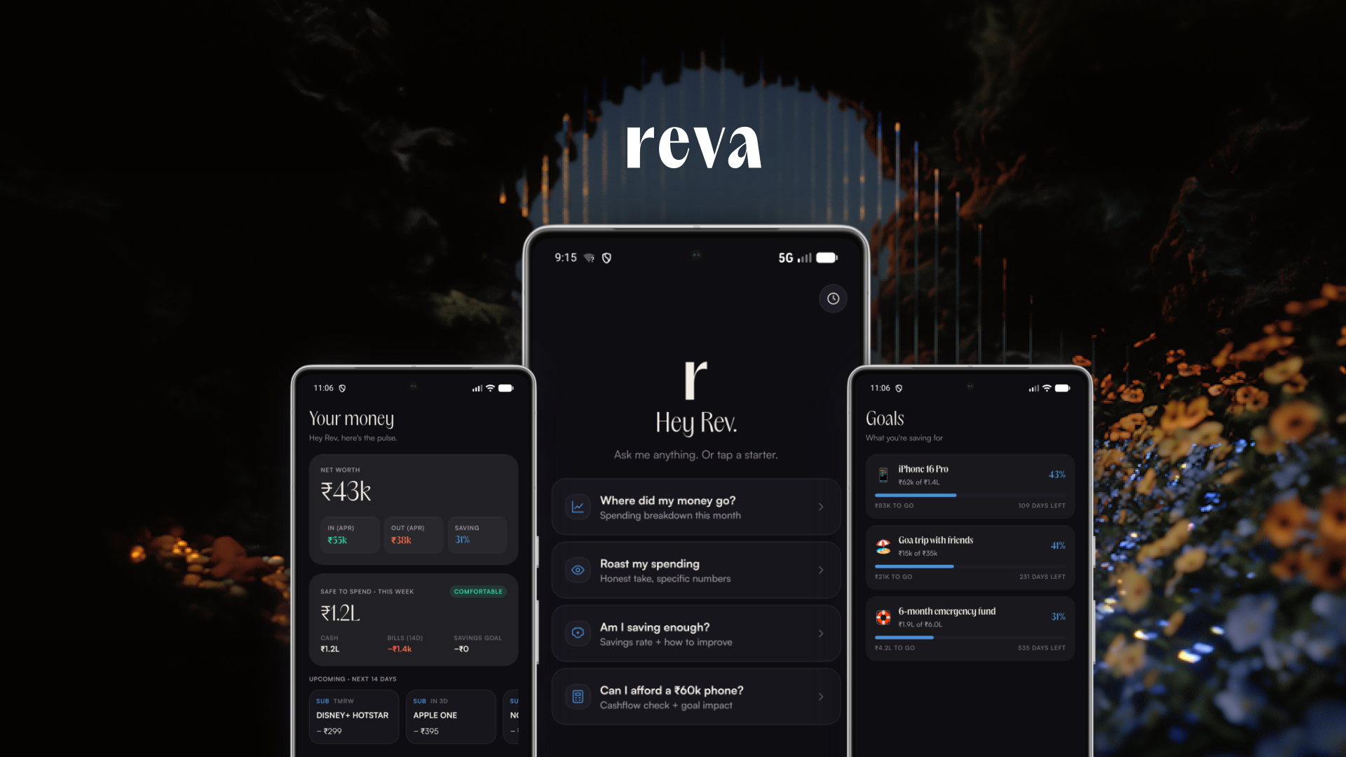
Just ask Reva.
Opens with “Hey Rev.” and four starter prompts, each mapping to a question from research: spending breakdown, honest assessment, savings analysis, affordability check. The AI always shows its math and talks like a friend who happens to be good with money.
Under the hood: 14 specialized tools for querying transactions, calculating savings rates, simulating credit scores, building projections. When you ask “can I afford this phone on EMI?”, it looks at your real income, recurring expenses, upcoming bills, and active savings goals. This is not generative text. It is computed answers wrapped in natural language.

Your full money pulse in one glance.
Answers one question: “Am I okay?” Net worth at the top in large type. Safe-to-spend for the week, broken down by category. Upcoming recurring charges with exact amounts and dates. Everything updates automatically from parsed SMS, with no manual entry, no refresh button, no sync step.
I deliberately kept this screen sparse. Density is the enemy of comprehension for this audience. If they need more detail, that is what the chat is for.

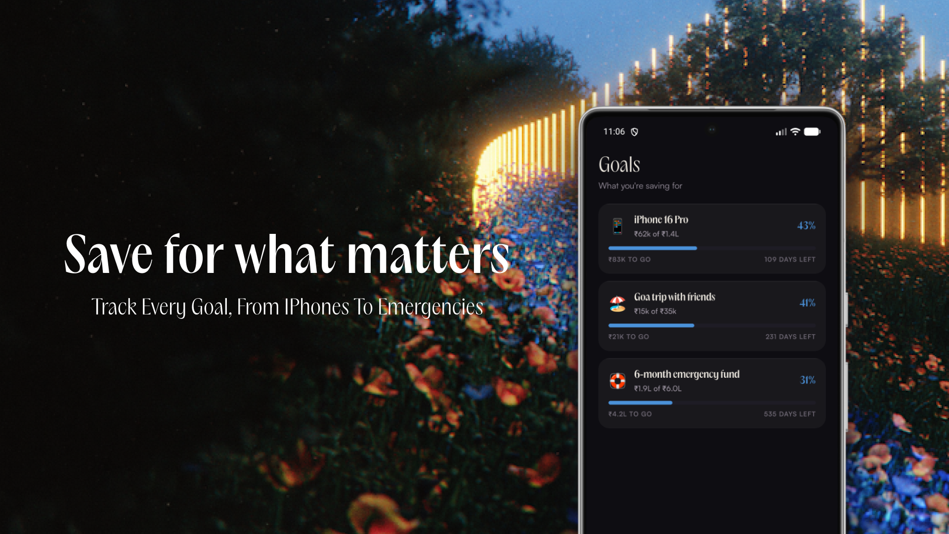
Save for what matters.
“I should save more” does not drive behavior. “I need ₹42,000 more for Goa in November” does. Each goal shows current progress, remaining amount, and status. Nothing else. No charts, no projections, no savings schedules. The complexity lives in the AI: ask “can I afford this?” and it factors in all your active goals.
Money skills, leveled up.
People would ask the AI about SIPs, get a good answer, then ask the same question a week later. The chat solved their immediate question without building lasting understanding. So I built 30 interactive lessons across three modules (Basics, Investing, Tax & Credit), all written for India specifically. Rupees, not dollars. SIPs, not 401(k)s. Section 80C, not standard deductions.
Engagement layer: XP, Rev Coins, daily streaks, completion badges. The hypothesis: users who build financial vocabulary will ask better questions in the chat and get more value from the entire product.

Your bank SMS never leaves your phone.
Privacy is an architectural constraint, not a policy promise. Reva reads bank SMS via Android’s Notification Listener, and all parsing happens on-device. Raw messages never upload anywhere. Only structured data (amount, category, merchant) syncs to the backend, encrypted. The AI never sees the original SMS text.
Because there is no bank linking or account aggregator signup, onboarding takes under two minutes. Sign in with Google, grant notification access, and Reva immediately builds your financial profile from existing messages. Value on the first session.
The technical layer that makes the design work.
React Native with Expo SDK 54. Supabase for auth, database, and storage. AI inference through a multi-provider failover chain: Cerebras primary (sub-second responses), Groq first fallback, Gemini and Together AI as additional layers. The chat stays responsive even when individual providers go down.
- On-device SMS parsing with auto-categorization across HDFC, SBI, ICICI, Axis, Kotak, and more.
- 14 AI tools: transaction lookup, budget calculation, SIP projections, CIBIL simulation, cashflow forecasting.
- Full Hindi localization: AI responses and all 30 lessons.
- Text-to-speech via Sarvam AI. Referral system, push notifications via FCM, PostHog analytics.
Not a wrapper. An agent with a 7-step reasoning loop.
A wrapper sends text to a model and returns whatever comes back. Reva reasons about what you need, pulls in context, picks the right tools, executes them, verifies the result, and only then responds. Every message runs through this loop:
- User Goal. Raw text enters the harness.
- Intent Capture. Classify complexity. Simple lookup or multi-step reasoning?
- Load Memory. Short-term context (token-budgeted) + long-term Mem0 search (top 5 facts about this user).
- LLM Reasoning. Cerebras → Groq → Gemini → Together AI failover chain.
- Tool Execution. Spending queries, savings rates, credit simulations, bill checks, any of the 14 tools.
- Verify & Persist. Parse charts and suggestions, store the turn in long-term memory.
- Loop or Done. More tool calls needed? Back to step 4. Otherwise, respond.
Five layers: UI → Orchestration (the loop above) → Memory (4K-token context window + Mem0 cloud) → Tools (14 agent tools + analytics engine with 9 pure functions and 8 rule detectors) → LLM Core (auto-failover). Data layer at the bottom: on-device SMS, Gmail OAuth, bank PDF parsing.
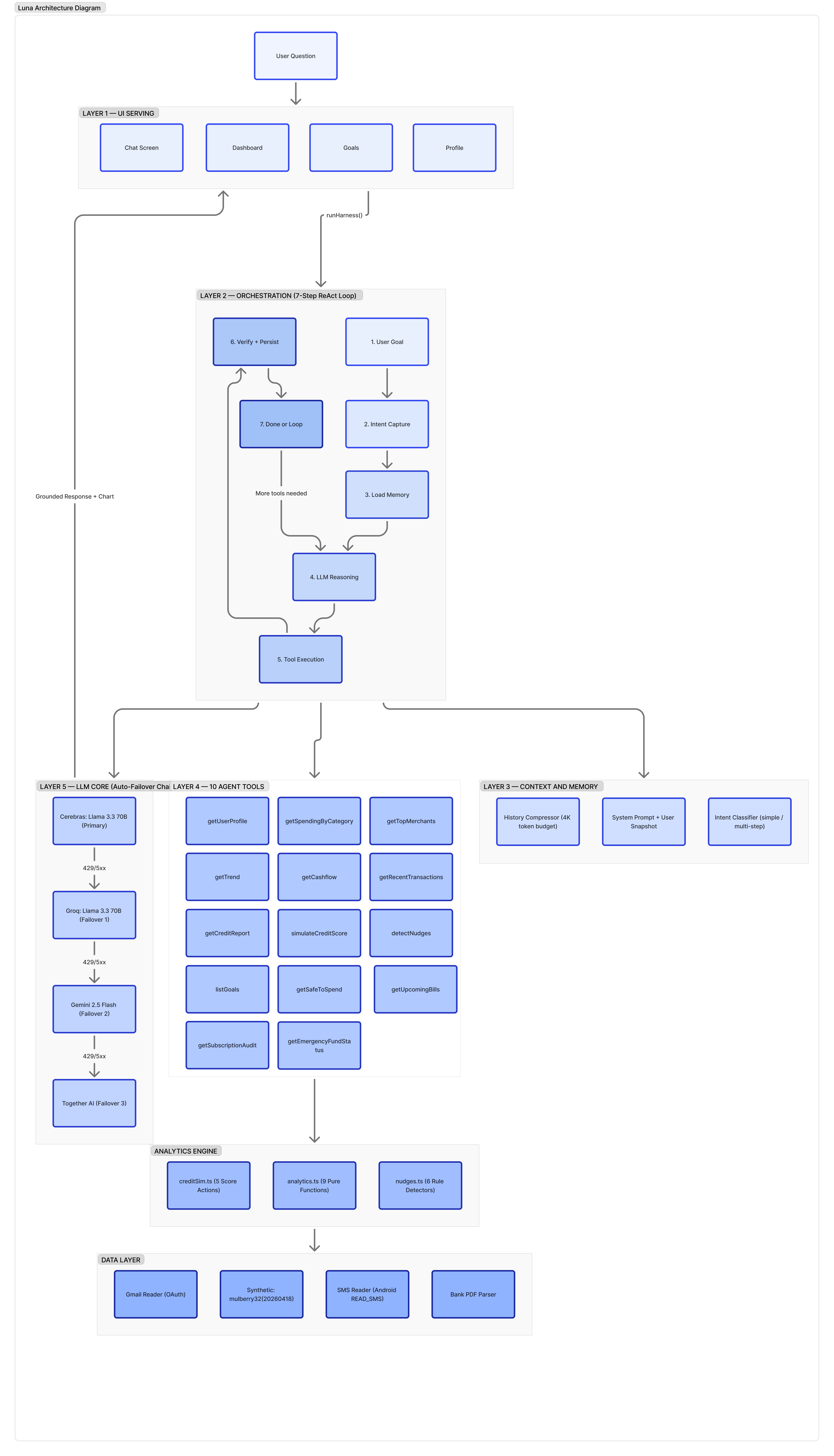
The model never guesses. Every number is computed by a tool, grounded in the user’s real data.
Reva remembers you. Not chat logs, but facts.
Traditional chatbots are goldfish. Mem0 sits between the app and the LLM as a memory layer. Instead of storing raw chat logs, it extracts discrete facts and stores them as searchable units. “I spend too much on Swiggy, trying to keep it under 5K” becomes two facts: “Swiggy budget: ₹5,000/month” and “considers Swiggy spending excessive.” Next time you ask about food spending, Reva already knows.
Three operations. Add. After every turn, extract facts, deduplicate, store per user. Search. Before every LLM call, vector similarity across that user’s memories. Update. Conflicting facts get updated, not duplicated. “I earn 80K” in March, “got a raise, now 95K” in May, and the salary memory just updates.
A 20-message conversation produces 3–5 memory facts. Those 5 facts (50 to 200 tokens) are all future conversations need. In Reva, the user’s email is the Mem0 ID. Memories get injected into the system prompt before every call. Storage is fire-and-forget: if Mem0 is slow or down, the user never notices. Over time, Mem0 builds a profile: name, bank, income, goals, spending patterns, communication preferences. All extracted automatically. No “save this” button needed.
Shipped, live, and learning from real users.
Reva is officially live on Google Play. Actively collecting feedback and iterating on information architecture, interaction patterns, and visual details. The screens here represent the current state, not the final form.
What changes when the interface is a conversation.
Every personal finance app has access to roughly the same data. The difference is whether people engage with it. A chart is passive: you look at it and maybe draw a conclusion. A conversation is active: you ask a question and get an answer specific to you. That shift changes the entire relationship the user has with their finances.
Building solo forced a discipline that is actually harder to maintain on larger teams. No room for speculative features. Every screen had to justify itself against the three design principles. The four surfaces that shipped are the four that survived that filter. A dozen others did not. The next phase is listening: hypotheses tested against real behavior, design moving wherever the data points.